
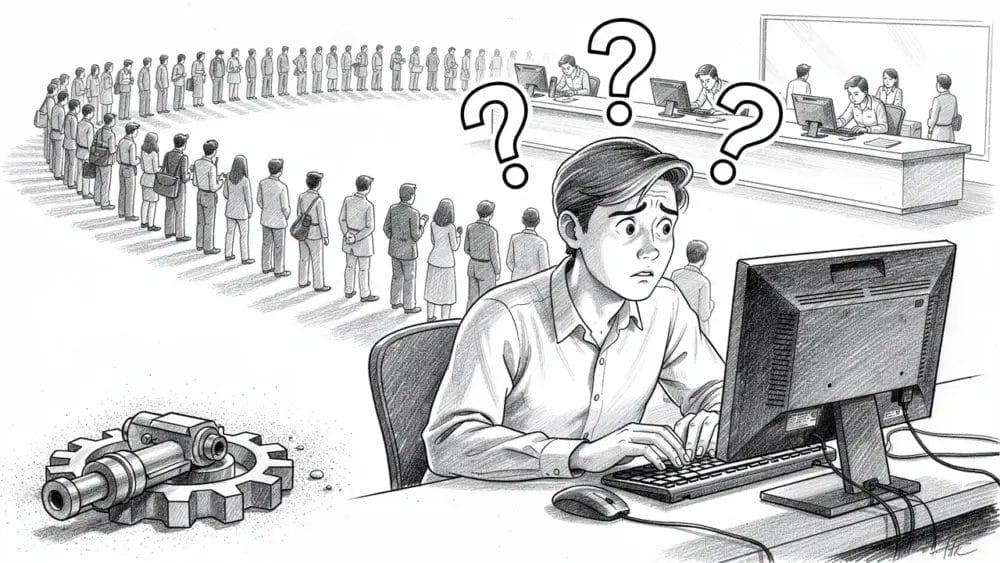
Most product teams set bold growth goals, yet a large share of SaaS trials never reach basic activation. Industry data from groups like OpenView Partners and ChartMogul shows that many products lose around half of their trial users before those users see any real value. After more than 25 years in SaaS, WordPress, and product development, I see the same pattern on repeat during numerous product audits.
When I am auditing UX friction points in SaaS products across industries, I am not looking for pretty screens. I look for places where users pause, backtrack, or give up. Those moments explain why strong products stall, why feature-packed platforms still leak revenue, and why teams feel confused when signups rise but active usage stays flat.
“People ignore design that ignores people.”
— Frank Chimero
Learning how to spot friction early separates teams that guess from teams that grow on purpose. Friction shows up as:
- missed clicks
- abandoned forms
- confused support tickets
- stalled onboarding
It drags down product adoption, makes retention harder, and quietly shapes how people talk about the product behind closed doors.
Here is the part most teams miss. UX friction points in SaaS products are not just problems to remove. They are direct signals of what people tried to do and did not manage to finish. Every stalled setup, every half-used feature, and every confusing screen is a pointer toward hidden demand and untapped value.
In this article I share eight specific friction patterns that I see again and again in B2B SaaS audits. These patterns hurt activation, retention, and expansion, yet they also highlight clear product opportunities in user experience. This is not a tour of button colors. It is a field guide on using friction as a diagnostic tool for product thinking, so you can stop guessing what to build next and start reading what your users already told you.
The products that win over time are not the ones with zero friction. They are the ones that learn from friction faster than competitors and turn those signals into a sharper roadmap.
What Friction Actually Tells You
UX friction points reveal three types of product gaps long before revenue reports do:
- Expectation gaps – Users arrive expecting one path, yet the product asks them to move in a different direction, so they stall.
- Value gaps – A feature exists, but the benefit is buried, so users do not see why it matters.
- Structural gaps – The underlying product model does not fit how people actually work day to day.
In one audit I reviewed a workflow that took 11 clicks for a simple recurring task. On the surface it looked like a basic usability issue. In reality it showed that the product had been built for expert power users while the marketing spoke to beginners. That mismatch crushed adoption and sent new customers back to spreadsheets.
When the same friction point appears across cohorts, users are voting with their behavior. They are showing you, step by step, where the product fails to match their mental model. Instead of asking only how to remove that friction, ask what that friction says about missing features, broken promises, or wrong assumptions.
“The details are not the details. They make the design.”
— Charles Eames
Here are the eight friction patterns I see most often and what each one is really telling you about product opportunity.
The 8 UX Friction Points That Signal Untapped Value
Before we dive into the list, keep one framing in mind. UX friction points in SaaS products are not random. They come from design choices, product bets, and tradeoffs that once seemed reasonable. When you study them with care, they stop feeling like bugs and start reading like field notes about your real market.
Each pattern below includes what you observe, what it signals, a real example from client work, and the concrete opportunity hiding underneath.
1. Users Abandon Mid-Flow Despite High Initial Engagement
This pattern appears when a large share of users start a key workflow with energy, then drop out in the middle. You may see 80 percent of new users begin a seven-step setup, yet only a small share reach step five or later. On dashboards the early activation numbers look fine, but completion and retention stay weak.
This friction shows that your product promised a clear outcome, yet the effort starts to feel heavier than the expected payoff halfway through. Users feel eager at step one, then somewhere around step three or four they realize they are doing unpaid admin work instead of making progress. Emotion shifts from interest to fatigue.
In one project management platform I audited, 72 percent of new users began creating their first project, yet only 31 percent finished. The killer step asked them to “configure project settings” before they had seen any board, task, or result. It felt like paperwork, not progress, so people bailed.
The opportunity is to move the first win much earlier in the flow:
- show a preview or starter example
- prefill smart defaults
- split the flow into two short phases where each phase ends with a small but clear result
Track time to first visible outcome inside the workflow, not only total completion. As a fast action, map where users expect to feel progress and where you ask them to do setup work, then move value moments forward.
2. Features With Low Adoption But High Support Volume
Sometimes a feature shows up as a paradox. Adoption sits under 15 percent, yet the same feature drives a large slice of support tickets and questions in your help inbox. Product analytics claim nobody uses it, while your support team spends half their week talking about it.
This pattern tells you that users care deeply about the capability but struggle to find or understand it. It is not a weak idea. It is a weak path to the idea. In other words, you have a value-discovery gap rather than a feature gap.
During one audit, I saw an advanced filtering feature hidden behind a small icon in a settings menu. Support kept receiving messages like “Do you support date range filters?” while that exact option sat three clicks away where no one looked. Product leaders were close to removing the feature based on low usage numbers.
The opportunity here is significant. You already built what people want. Now the job is to raise its profile with:
- better placement
- clearer naming
- onboarding cues and prompts
Promote it in empty states, surface it in context right when users face the related problem, and update onboarding sequences to show it early. Track the feature discovery rate (the share of users who reach that screen within their first week) before you judge value.
3. Repetitive Manual Actions Users Perform Daily
When I review session recordings, one pattern always makes me pause. A user repeats the same five-click sequence over and over during a single session. They never complain. They never file a ticket. Yet they lose hours each week repeating a task the product should handle for them.
This friction means users have learned to work around your limits. They accepted the pain as normal and stopped asking for help. That silence is dangerous because you will not see it in feedback forms. You only see it when watching real behavior in tools like Hotjar or FullStory.
In one CRM audit, sales reps copied eight fields from a lead form into a contact record for every single prospect. No bulk import, no auto mapping, no quick actions. Reps did this 30 or more times per day. When I asked why, they shrugged and said “that is just the process.”
Every repeated sequence is a hidden feature request. Users already defined the pattern, so you do not need a big research project. You need automation, templates, bulk actions, or smart defaults. Track time spent on common manual paths per session and list the three longest. Then ask for each one whether simple automation can support the user instead of the user supporting the product.
4. Long Time-To-Value For Core Workflows

Another painful signal appears when core workflows take too long to show any form of output. Users spend an hour wiring integrations, filling long forms, or tuning settings before the product shows them a single meaningful result. Many trials die right there.
This friction shows that the team placed all the hard work at the front and delayed proof that the product works. In a world of short attention spans and many choices, that design choice kills product adoption and leads to UX issues that hurt retention.
I once audited an analytics platform that required 45 minutes of setup before drawing a single chart. Users had to add tracking code, define events, and map properties as the very first task. Around 68 percent of trial users disappeared during that process, long before they could see even a simple graph.
The opportunity is to flip the script. Show sample data, offer starter templates, or guide users through a “quick mode” that shows a basic but real result in the first five to ten minutes. Then invite them to deepen the setup later. Track time to first “aha moment” such as first report, first invoice, or first completed task. That number must shrink. As a starting point, ask your team what the smallest real result you can show in 60 seconds, then design onboarding around that onboarding path.
5. Users Rebuild What Your Product Already Offers
Sometimes users leave your app, open a spreadsheet, and finish their work there even though your feature list covers the same ground. They export data, copy and paste, or send data to another tool to get the job done their way.
This friction points to a workflow mismatch. The feature exists, but its shape does not match the way users think or work. The problem is not absence. The problem is inflexibility, missing controls, or poor fit with real processes.
In one invoicing platform I reviewed, reporting usage looked decent inside analytics. Yet around 40 percent of active users exported raw data to Excel every week. When I asked what they did next, they showed custom reports with their column order, extra ratios, and client-specific tags the built-in reports did not support.
Their “hacked” reports became the clearest product brief in the entire audit. By observing how they rebuilt the same idea, we saw which fields mattered, which filters they needed, and how they wanted to group data. That insight drove a roadmap for more flexible native reporting. Track export frequency and common third-party connections. High usage on those paths often means your product missed the last mile of value.
6. High Engagement With Manual Overrides And Custom Settings
Watch how often new users change your default settings during their first week. When more than half of them race to preferences or use manual entry instead of your automated flow, they are sending you a clear message. They do not agree with your opinions about how work should happen.
This pattern tells you your defaults are wrong for the real world. Product teams love to design a “happy path” and ship strong opinions as defaults. When the majority of users override those defaults, your edge case thinking has taken over the main use case.
I saw this with a scheduling tool that assumed 30-minute meetings were ideal. The app defaulted every slot to 30 minutes. In practice, more than 80 percent of users edited every single meeting to 60 minutes. The default did not save time. It added yet another step.
The opportunity sits in plain sight. Review which settings get changed most during the first seven days and treat those changes as research. Those adjustments show how users frame their work. Adjust your presets to match actual behavior, not an internal fantasy of perfect efficiency. When you think about how to identify UX friction, this is one of the fastest tests to run, since the data already lives in your settings logs.
7. Forms That Request Information You Already Have
Few things annoy users more than typing the same field again and again. They enter an email during signup, reenter it in profile settings, and type it a third time when exporting a report. Each repeat reminds them that the system did not remember a basic fact about them.
This friction tells you something important about your architecture. The product treats each module as a separate island. Data does not flow, and different parts of the system do not share user context. That often traces back to technical debt or siloed teams that built features in isolation.
In one SaaS tool I audited, new customers answered questions about company size three different times. Once during signup, once inside account settings, and once when asking for industry benchmarks. Each feature used its own database field and no one had wired them together.
The fix is both technical and experiential. Build a single user profile layer that stores core attributes one time and reuses them everywhere. Use that context to prefill forms and skip steps. Count how many duplicate data entry points exist across your main flows and set a goal to remove them. Reducing this type of friction improves trust because it shows users that your system is paying attention.
8. Users Stop Using Your Product After Achieving Initial Goal
The last pattern shows up when activation looks strong, yet long-term activity stays weak. New users complete the first core task, get their initial result, and then disappear after a week. Month-two metrics sag, and churn creeps up even though onboarding looked solid.
This friction reveals a missing retention loop. The product solves a single point-in-time problem and then gives users no reason to return. That is deadly for a subscription business that depends on repeated value, not just a single win.
I worked with a resume builder that nailed its first impression. Around 85 percent of new users finished a polished resume. Yet only 12 percent returned in the following month. The main job was done, and the rest of the product offered no ongoing support or tracking.
Here the opportunity is either to design recurring value or to adjust the business model. Recurring value can mean progress dashboards, job tracking, status alerts, or sharing features that involve other people. If the core job is truly one time, then a monthly subscription format is the wrong fit. Track the week-two return rate and 30-day active retention. If those numbers fall below 40 percent, you do not have a feature problem. You have a missing retention loop that must be part of the product strategy.
How I Prioritize Friction Points To Fix

After more than 90 audits, I keep prioritization simple. I use a matrix with two axes. One axis is frequency, which shows how many users hit the friction. The other axis is impact, which shows how badly it hurts core metrics like activation, retention, or expansion. Every friction item earns a spot on this grid before it reaches the roadmap.
High-frequency and high-impact issues sit in the emergency lane. They touch a large share of users and drag down direct revenue numbers such as trial-to-paid or net retention. Onboarding friction that affects 60 percent of trials and kills 40 percent of conversions lands here, and I treat it as more important than any new feature idea.
High-frequency and low-impact issues still matter, but I group them with design system work. An awkward button or extra confirmation step that only adds two seconds does not need its own sprint. I roll many of these into the next design refresh so the team handles them in bulk.
Low-frequency and high-impact issues often appear around advanced features or enterprise accounts. Only a small segment hits them, yet those users may pay a large share of revenue. For those, I design targeted fixes or guided flows that help that group succeed without reshaping the whole product.
Low-frequency and low-impact issues go into a parking lot. A rare cosmetic issue that affects two percent of users once a year does not deserve attention before the cleaner wins. I still log it, but I do not treat it as part of active work.
The key is to fix friction that compounds across the user path first. Early funnel problems affect activation, later engagement, and even referrals, so every week you delay costs more. If I cannot tie a friction point to a clear retention, conversion, or expansion metric, I do not prioritize it. That focus keeps my prioritization process honest and keeps UX work tied to business outcomes, not just polish.
“Usability is about people and how they understand and use things, not about technology.”
— Steve Krug
Conclusion
Friction is not just a UX mess to sweep away. It is a clear signal that marks the gap between what users intend to do and what the product lets them achieve. The products that grow fastest are not free of friction. They are led by teams who read UX friction points in SaaS products as live feedback on product thinking and move based on that insight.
Across three decades, I have never seen a high-growth SaaS company that removed every rough edge. I have seen plenty that studied user struggles, learned from them faster than rivals, and turned those patterns into a sharper roadmap. They treated friction as a teacher, not just a nuisance.
If users keep complaining about the same steps, they are not just venting. They are explaining which product decisions missed the mark. Instead of running away from that noise, ask what those patterns say about your activation paths, pricing, or feature design. The richest product opportunities in user experience usually sit right behind the loudest complaints.
Good UX is the result of clear product thinking, not the starting point. When product decisions line up with real behavior, interfaces start to feel simple almost by default. When they do not, no amount of surface polish saves the numbers.
Friction is expensive to ignore and invaluable to understand. The question is not whether your product has it. The question is whether you are listening. If you want experienced eyes on the friction points that are draining your retention, request a product teardown and I will show you exactly where users stall and what it costs your business.
FAQs
1. How To Identify UX Friction In SaaS Products
Start with quantitative data from analytics. Review funnel drop-offs, feature adoption, and paths where session recordings show hesitation or repeated steps. Add qualitative data by reading support tickets and asking users which tasks feel harder than they expect. Run a simple click test on core actions and track time to value for each main workflow.
2. What Causes User Friction In SaaS Onboarding
The main causes are asking for information before showing value, unclear value on first screens, and long paths before users see results. Onboarding friction grows when teams front-load setup tasks and hide any form of quick win. Many SaaS products lose 40 to 60 percent of trials in the first session because the time to value goes past user patience.
3. What Is The Difference Between Good Friction And Bad Friction
Good friction is intentional and protects or teaches the user, such as a confirmation step before deleting data, strong password rules, or staged onboarding. Bad friction is accidental and blocks progress without any clear benefit, such as confusing menus, redundant forms, or slow pages. A simple test is to see whether users thank you for it or complain about it.
4. How To Prioritize UX Friction Fixes In Product Roadmap
Use a matrix that balances frequency and severity. Fix issues that hit many users and damage activation, retention, or expansion before anything else. Give targeted attention to less frequent issues that affect key segments such as enterprise customers. Leave rare, low-impact quirks for later. Focus on friction that appears early in the path because it compounds across the full experience.
5. Can UX Friction Reveal Product Opportunities
Yes, UX friction often exposes the clearest product opportunities in user experience. When users copy data between tools, they point to missing integrations. When they ask for features that already exist, they reveal discovery problems. When they repeat manual actions, they show where automation belongs. Each pattern tells you how the product needs to evolve to match real demand.
6. Best Tools To Track UX Friction Points
Use event analytics platforms such as Mixpanel or Amplitude to see funnels and feature usage. Pair them with session recording tools such as FullStory or Hotjar to watch real behavior. Add heatmap tools such as Crazy Egg for click patterns and in-app survey tools like Pendo or Appcues for direct feedback. Even a small set of recordings reveals friction you did not expect.
7. How Do I Know If A Feature Is Too Complex Or Just Unfamiliar
Watch adoption over time. If usage stays low after a month, the feature is too hard, not just new. Review recordings of users trying it and stopping halfway. Run tests with fresh users and see whether they complete tasks with light guidance. If support keeps explaining the same feature again and again, you do not have a learning issue, you have a design issue.